Tuesday, October 31, 2006

collage mapping

language archipelago at night:


satellite imagery of the world at night reveals the relative industrial development of an area. it also reveals population hubs, transportation systems, etc. internet development parallels industrial development, which explains the concentration of light at the center of the language archipelago.


the world at night...without the language archipelago:

Monday, October 30, 2006

mapimation final

animations:


fixed camera / axon


moving camera / perspective

stills:


axon


perspective

Monday, October 23, 2006

animations:


internet hops


quicktime VR


powerpoint:


Sunday, October 22, 2006

Friday, October 20, 2006

mapimation 1.6

here is the lastest. this represents the first portion of the animation. more to come later.


quicktime movie


keyframe01


keyframe02


keyframe03

Wednesday, October 18, 2006

mapimation 1.5

here are a couple stills of the internet hops:


Friday, October 13, 2006

mapimation 1.4

in order to map the 3d language archipelago more readable/understandable, i placed each country as a 2d surface in the place of each of the spheres from the last draft. below is a quick animation fly-by followed by rendered frames.


click above to see the animation


plan


keyframe01

keyframe02

keyframe03


keyframe04

Wednesday, October 11, 2006

mapimation 1.3

i am still trying to refine my direction in my mapimation. i have decided to further limit the scope of my investigation to make the data more manageable. as such, i will look at all countries with a population greater than 10 million (megacountries) that speak one of the ten internet languages.

it seems that i have two things to map: physical and virtual; language and the internet exist in both of these realms. (when i speak of language, i will limit it to large, concentrated communities that share a common language and overlook small language pockets.) language is generally grounded to physical/geographic regions; it also virtually connects people acoss great distances. the internet is exactly the same....grounded in the physical world by existing in the virtual world. as such, i would like to map the physical condition of the internet and language. (see keyframes 1 below). i would then like to morph the map from he 2d geographic world to a 3d language archipelago and abandons geography to illustrate the interconnection of countries based on the language and the internet. (see keyframe 2).


keyframe01: as in earlier drafts, traceroues are geolocated and mapped to show internet infrastructure. topography will be added to indicate router location. color will be added to show language groups.


keyframe02: the countries will morph to this orientation. the image shown is a prototype. each red sphere represents a country. in the final, the size of the sphere will represent the population of the country. the lines represent language connections. in the final, i hope to make these lines have less visual impact so that i can map internet hopping back to the origin.

click the image below to see a quicktime vr of the language archipelago:

thoughts on breeze

i think that breeze has some very interesting features, but im not sure that it alone is suited for desk crits. the desktop share feature is a great way to let ron see our thought process and to possibly assist in formz. i do not like the way that the talking works, since only one person can speak at once. as a result, it seems that we give ron our little speech and then he gives a little speech back to us, instead of a more interactive conversation. maybe breeze is more suited for formal presentations/reviews and that vyew + skype + blog is better for desk crits.

Monday, October 09, 2006

mapimation 1.2

here is the next iteration of the mapimation. i have been working on creating a trail that marks the path that the hops take. the method that i used is extremely time consuming and not really feasible at a large scale unless i can create a macro to do it for me.


also, here is a link to my data worksheet.

i plan to add topography to the countries based on the location of the most important internet routers. the degree of the deformation of the land caused by these routers will correlate to their influence in the internet. here is a rough draft:

Thursday, October 05, 2006

mapimation 1.1

of course, my mapimation is still very much a work in progress. gathering data has proved to be very time consuming. i have sketched out a storyboard to convey the general concept. i should have preliminary animation done by studio on monday.

i am going to focus on the internet and world wide web as they relate to language. i also hope to make the infrastructure of the internet apparent through the map. language is of course a limiting factor in communication and thus the internet. the languages of the 313 billion website online:
  1. english / 68.4%
  2. japanese / 5.9%
  3. german / 5.8%
  4. chinese / 3.9%
  5. french / 3.0%
  6. spanish / 2.4%
  7. russian / 1.9%
  8. italian / 1.6%
  9. portuguese / 1.4%
  10. korean / 1.3%
  11. all others / 4.6%

more to come on language of the internet in a megablog post.


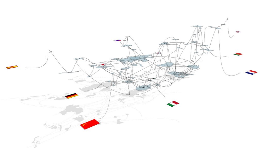
i will map the path that data takes from the u.s. to each country that significantly speaks one of the above ten languages. a language will defined as significantly spoken if it is an official language for the country, an official language within a region of the country, and/or spoken by more that 1% of the inhabitants of the country. as such, some countries will fall into multiple language categories (the u.s., for example, belongs to each language category)

here is the storyboard:
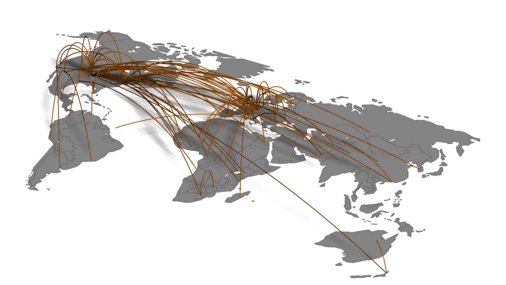
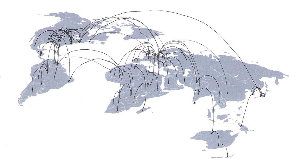
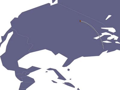

keyframe01
: the data begins to hop from origin. appears as continuous stream of packets (represented by small spheres or other simple geometric shape). the height of each hop is determined by the total number of packets that make the same hop.
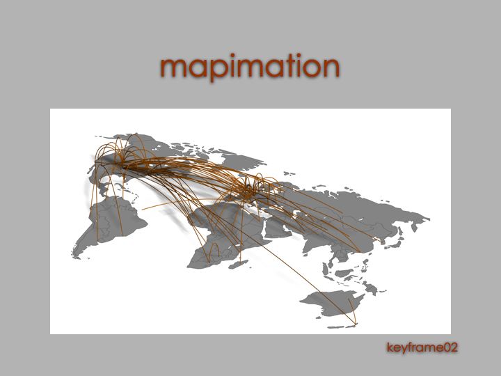


keyframe02
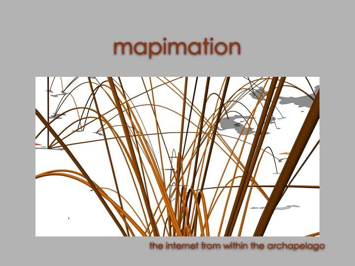
: the data continues to stream from origin. it continues to hop to its final destination, an internet server in each country. the order is determined by the ping time of each final destination. the data leaves a trail/residue along the path that it travels. this begins to create spatial implications that indicate the structure of the internetwork.
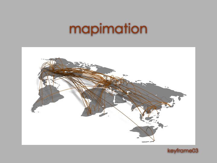


keyframe03: all the packets have reached their final destination. the residues of their hops creates an interwoven fabric across the globe. the animation pauses here briefly.
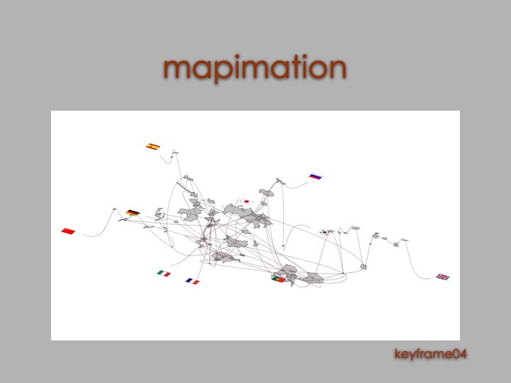


keyframe04
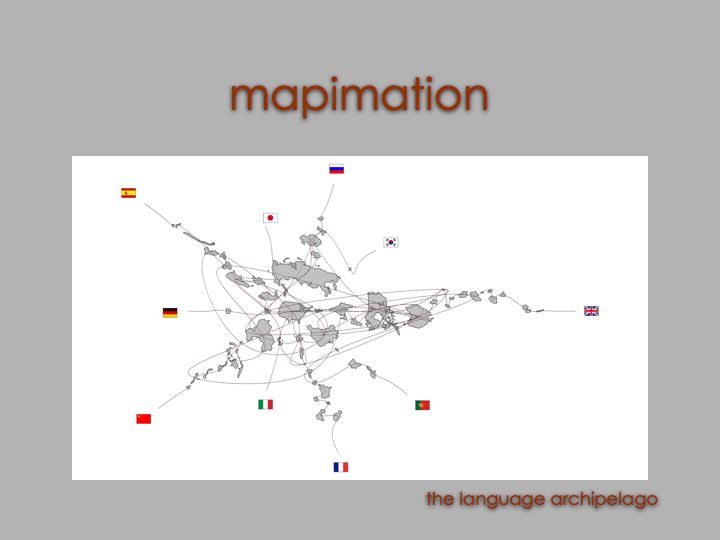
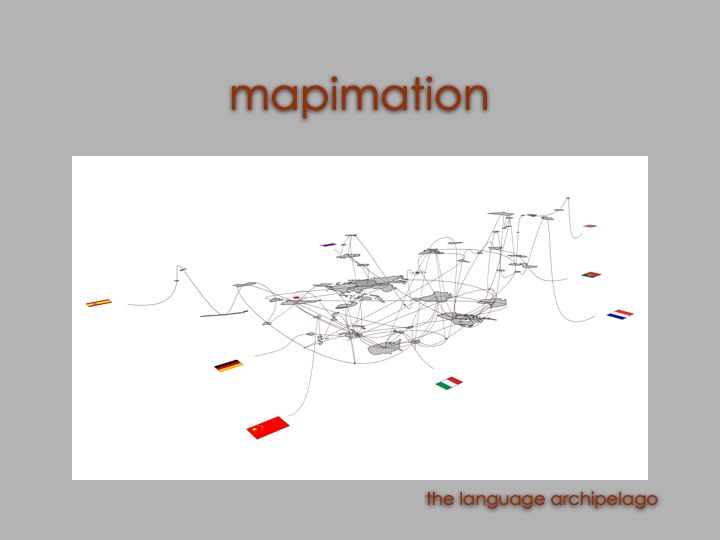
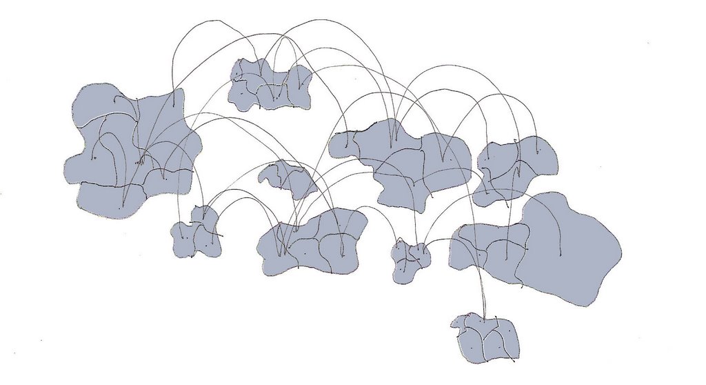
: the globe is reorganized to create language continents. the movement of the countries is animated. the residue of each hop is moved with each country. the animation pauses briefly. then, each packet hops back to the origin along the reorganized paths. this intent is to show not only the 'language continents' but the dependence on the infrastructure which pays no mind to language barriers.
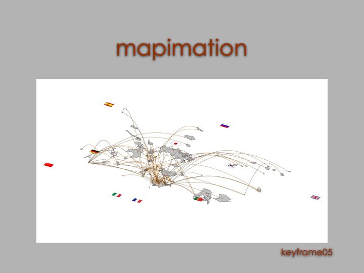


keyframe05: all the residuals are gone. here is the globe reorganized by language.

mapimation base map

this is base map that nate found, a bit cleaned up. i fixed some overlapping lines. also, because i needed to for my map (and because it am a total dork) i labeled all the countries. the map is a bit distorted to reflect the earth's curvature. the lines are not the smoothest, but it should be more than sufficient for this scale. each country is a surface. the surface style is light blue rendered with a grey wireframe. click on the image below to download the .fmz file:

Monday, October 02, 2006

mapimation 1.0

here is a first attempt at a mapimation. it shows the path that data takes to travel from germany to clemson. click the image to link to the .mov file.


the thought is that a mulititude of traceroutes to clemson could be animated at once. the 'velocity' of each leap needs to be refined to better reflect the actual time of the transfer (in milliseconds).